Zum Inhalt springenSkip to content
NeonPulse · Case Study

Neon als Signal.
Nicht als Deko.

Neon as signal.
Not decoration.

NeonPulse ist ein dark-first Design System für Web- und App-Produkte – von der Farbrampe über ein vollständiges Komponenten-Set bis zu vier interaktiven UI-Kits. Konzipiert, gestaltet und in Code umgesetzt von kudesi.

NeonPulse is a dark-first design system for web and app products — from the colour ramp through a complete component set to four interactive UI kits. Conceived, designed and built in code by kudesi.

UmfangScope KonzeptConcept Visual Design Design Tokens KomponentenComponents DokuDocs Front-end
Live · echte SystemklassenLive · real system classes
p99 latency · live
42ms
us-east · 3 nodes
Online
141
Design Tokens
59
Komponenten & PatternsComponents & patterns
2
Themes · Dark & Light
4
Interaktive UI-KitsInteractive UI kits
AA
Kontrast aller Text-TokensContrast on all text tokens
0
Build-StepsBuild steps
01 · AnsatzApproach

Cyberpunk, aber ruhig.

Cyberpunk, but calm.

Dunkle Neon-Oberflächen kippen schnell ins Laute: Glow auf jeder Karte, zu wenig Kontrast, jede Komponente mit eigenen Farben. NeonPulse setzt dagegen sechs klare Prinzipien, die jede Entscheidung im System begründen. Drei davon im direkten Vergleich:

Dark neon interfaces tip into noise fast: glow on every card, too little contrast, every component with its own colours. NeonPulse counters that with six clear principles that justify every decision in the system. Three of them, side by side:

PrinzipPrinciple 01

Dunkel ist die Leinwand, Neon das Signal

Dark is the canvas, neon is the signal

Rund 90 % der Fläche sind Near-Black und Grau. Neon markiert ausschließlich, was interaktiv oder live ist – dadurch weiß das Auge sofort, wohin.

Roughly 90% of the surface is near-black and grey. Neon only marks what is interactive or live — so the eye knows instantly where to go.

Do
Nodes18 onlineAll healthy.Deploy
Don't
Nodes18 onlineAll healthy.Deploy
PrinzipPrinciple 03

Glow ist ein Zustand, kein Stil

Glow is a state, not a style

Halos erscheinen bei Hover, Fokus, Aktiv und auf Live-Daten – nie als Dauerdekoration. So bleibt Leuchten eine Information.

Halos appear on hover, focus, active and on live data — never as permanent decoration. That keeps light meaningful.

Do
Hover / FokusHover / focus Probier michTry me
Don't
Requests
Latency
PrinzipPrinciple 04

Mono ist die HUD-Stimme

Mono is the HUD voice

Labels, Metriken und Status stehen in JetBrains Mono, Versalien, 0.14em Laufweite. Das macht den Look aus – nicht zusätzliche Farbe.

Labels, metrics and statuses are set in JetBrains Mono, uppercase, 0.14em tracking. That creates the look — not extra colour.

Do
p99 latency42ms
Don't
P99 Latency:42 ms
02 · Flat statt Schatten-StapelFlat, not stacked shadows 05 · Weiche Radien, präzise BewegungSoft corners, precise motion 06 · Keine Emojis – Lucide-IconsNo emoji — Lucide icons
02 · ArchitekturArchitecture

Fünf Ebenen, ein Vertrag.

Five layers, one contract.

Jede Ebene baut nur auf der darunterliegenden auf. Komponenten konsumieren ausschließlich semantische Aliase, nie Rohwerte. Ein Rebrand oder ein neues Theme ist damit eine Änderung an einer Stelle – statt Suchen-und-Ersetzen im ganzen Code.

Each layer only builds on the one below it. Components consume semantic aliases only, never raw values. A rebrand or a new theme becomes a change in one place — instead of find-and-replace across the codebase.

01 · PRIMITIVES

Was ein Wert ist

What a value is

Farbrampen, Typo-Skala, Spacing, Radien, Motion.

Colour ramps, type scale, spacing, radii, motion.

--neon-cyan
02 · ALIASES

Wofür er da ist

What it's for

Der Vertrag zwischen Design und Code.

The contract between design and code.

--color-accent
→ var(--neon-cyan)
03 · ELEMENTS

Ein Control, jeder Zustand

One control, every state

Button, Input, Switch, Badge, Tabs …

Button, input, switch, badge, tabs …

.np-btn
04 · PATTERNS

Kompositionen

Compositions

Cards, Layout-Primitives, Overlays, Leer- und Ladezustände.

Cards, layout primitives, overlays, empty and loading states.

05 · UI-KITS

Echte Screens

Real screens

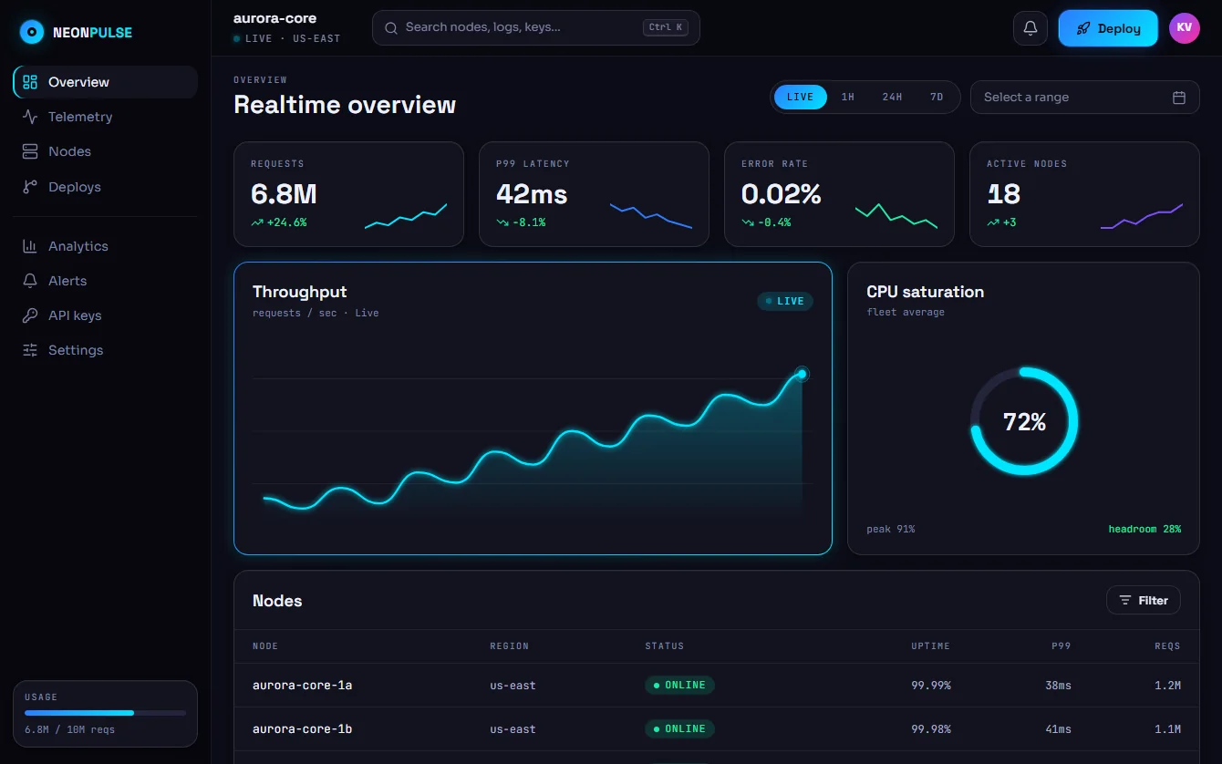
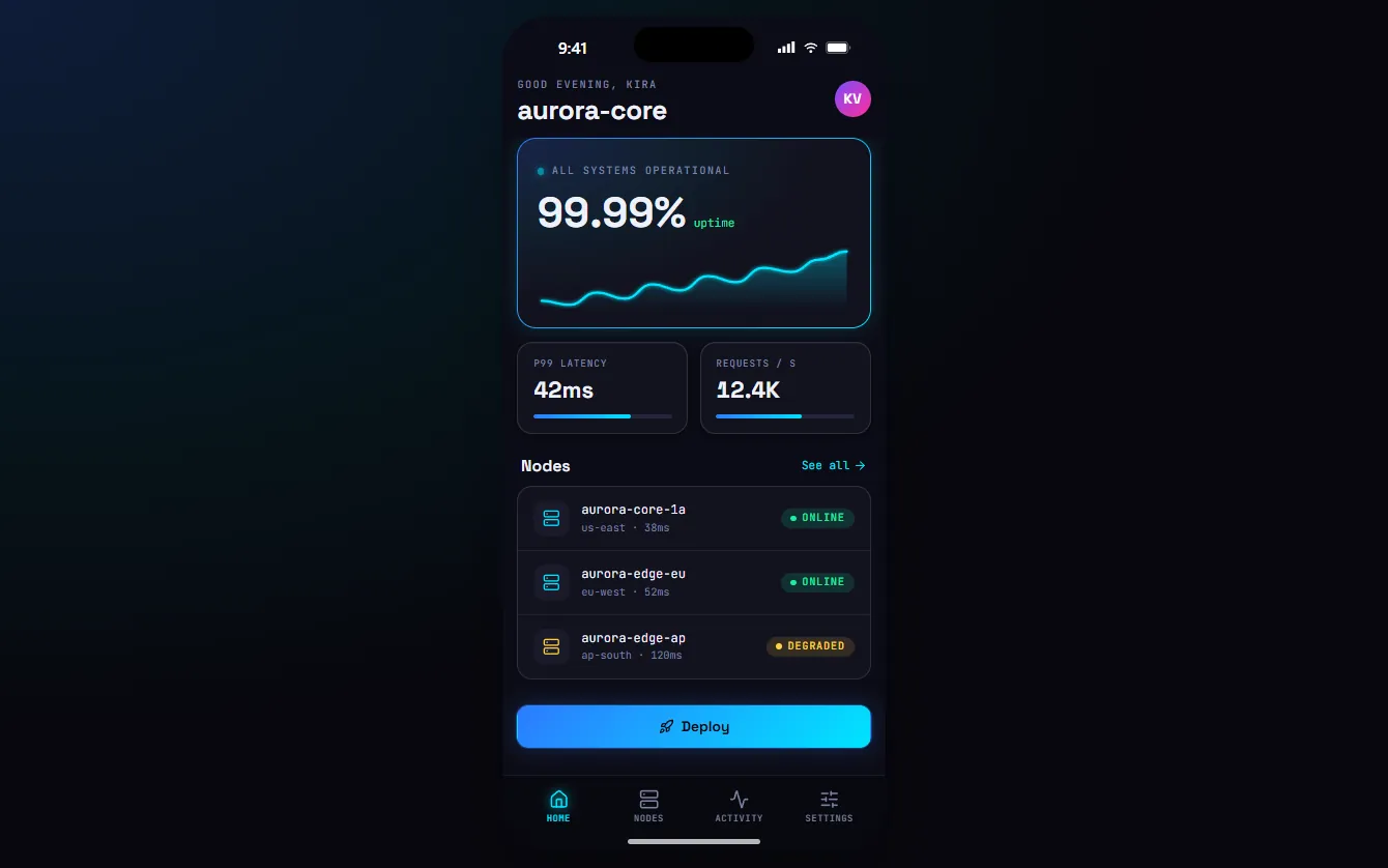
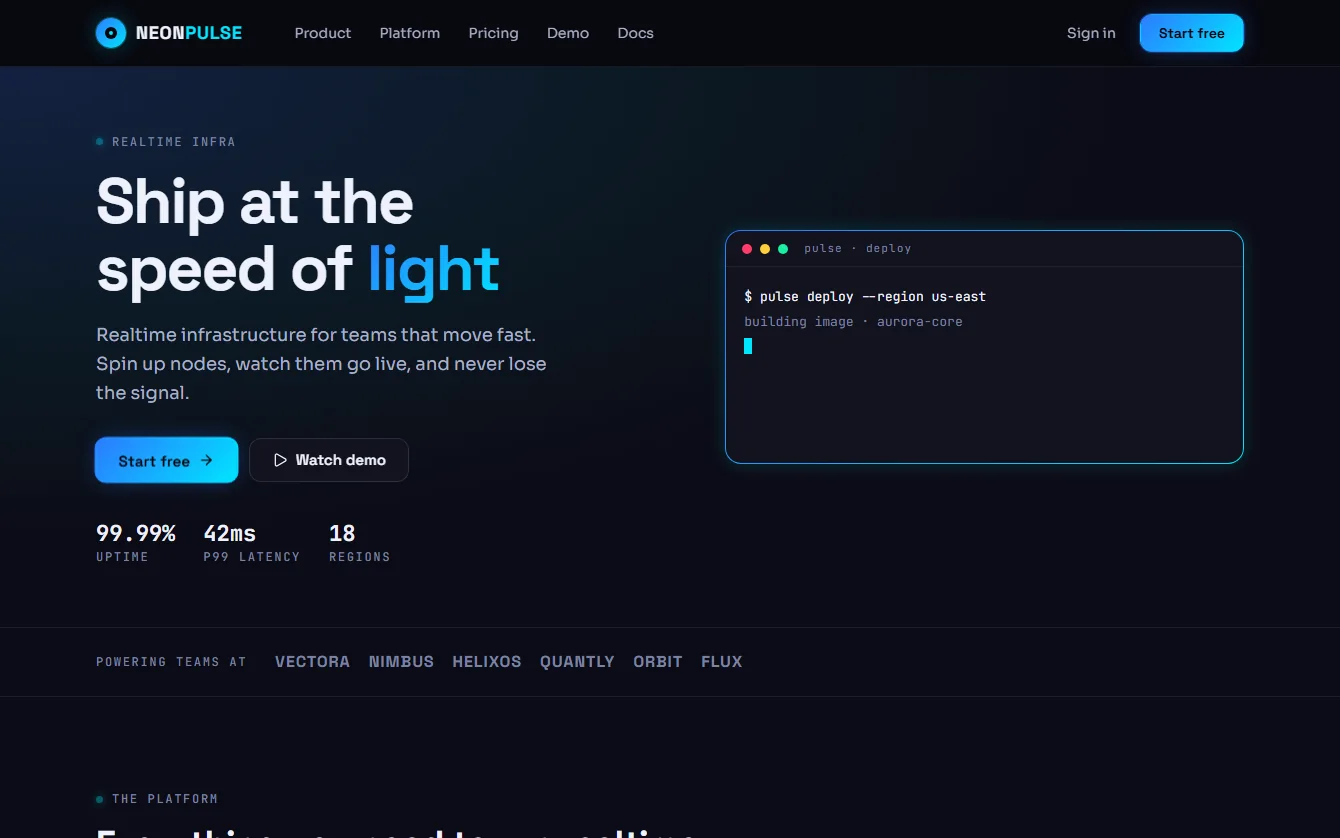
Der Praxistest: Produkte, gebaut nur aus dem System.

The proof: products built from the system alone.

MarketingDashboardMobileBank
/* 01 · Primitive — what a value is */
--neon-cyan: #00e5ff;

/* 02 · Alias — what it's for */
--color-accent: var(--neon-cyan);

/* 03 · Element — consumes aliases only */
.np-icon-btn:hover {
  color: var(--color-accent);
}

Zwei Token-Ebenen trennen Wert und Bedeutung. Designer:innen und Entwickler:innen sprechen über --color-accent, nicht über #00e5ff – und Light Mode ist nur eine zweite Belegung derselben Namen.

Two token tiers separate value from meaning. Designers and developers talk about --color-accent, not #00e5ff — and light mode is just a second set of values for the same names.

Zustände (Hover, Fokus, Aktiv, Laden, Deaktiviert) werden aus Interaction-Tokens und Pseudo-Klassen abgeleitet – einmal definiert, überall identisch.

States (hover, focus, active, loading, disabled) are derived from interaction tokens and pseudo-classes — defined once, identical everywhere.

03 · Theming

Ein Attribut. Ein neues Theme.

One attribute. A new theme.

Probier es aus: gleiche Komponenten, gleiches Markup – nur das Theme-Attribut und zwei Primitives ändern sich. Der Light Mode hält dabei dieselben Kontrastregeln ein wie Dark.

Try it: same components, same markup — only the theme attribute and two primitives change. Light mode keeps the same contrast rules as dark.

Theme
MarkenfarbenBrand hues
Overview

aurora-core

Requests
6.8M
+24.6% ↑
p99 · live
42ms
us-east
Usage
68%
Deployed. Live in us-east.
api-gatewayOnline
worker-euDegraded
04 · KomponentenComponents

Jeder Zustand definiert.

Every state defined.

Hover, Fokus, Aktiv, Laden, Deaktiviert, Fehler, Leer: Zustände werden aus Tokens und Pseudo-Klassen abgeleitet statt pro Komponente gemalt. Alles hier ist echt – fahr mit der Maus drüber oder navigiere per Tastatur. Und alles ist mobile-first: fünf Breakpoints vom Smartphone bis zum Ultrawide, eine App-Shell, 44-px-Touch-Ziele.

Hover, focus, active, loading, disabled, error, empty: states are derived from tokens and pseudo-classes instead of being painted per component. Everything here is real — hover it or tab through it. And everything is mobile-first: five breakpoints from phone to ultrawide, an app shell, 44px touch targets.

Buttons.np-btn · 4 intents × 6 states
HoverDeploy
FocusDeploy
ActiveDeploy
LoadingDeploy
DisabledDeploy
Status.np-badge · .np-banner
Online Degraded Offline Syncing
Auto-scale nearing the node limit.
FormulareForms.np-field · .np-input · .np-switch
Navigation.np-tabs · .np-seg
Feedback.np-toast · tooltip
Deployed. Live in us-east.
42ms p99 · 3 nodes online
← Hover oder Tab für Tooltip← hover or tab for tooltip
DatenData.np-table · .np-meter
NodeStatusp99
core-1aOnline38ms
edge-apDegraded120ms
Usage · 6.8M / 10M
BefehlspaletteCommand palette.np-palette · ⌘K
  • OverviewG O
  • AlertsG A
  • Deploy…⌘ D
Leer & LadenEmpty & loading.np-empty · .np-skeleton
Nothing online yet
Spin up your first node to see it here. Add node
IconsLucide · 1.9 stroke
LIVE SUCCESS WARNING DANGER DEPLOY SETTINGS
Ein Name pro Bedeutung – für Design und Code.One name per meaning — shared by design and code.
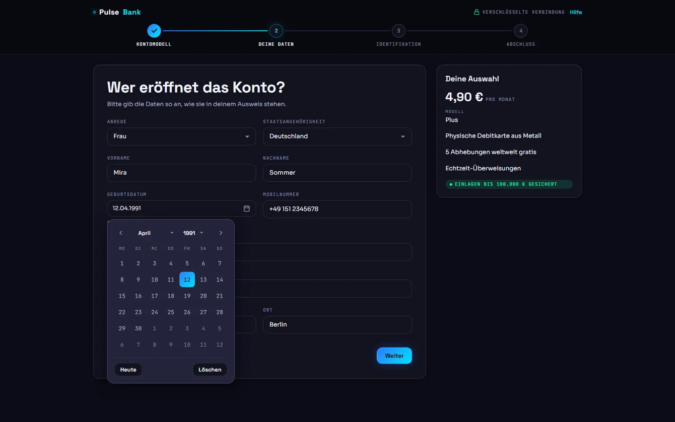
Datum & ZeitraumDate & range.np-datepicker · popover → bottom sheet
Tippen oder wählen. Monat und Jahr als Dropdown, ab 18.Type or pick. Month and year as dropdowns, 18 or older.
ZeitraumPeriod
Voreinstellungen, auf breiten Schirmen zwei Monate.Presets, two months on wide screens.
VerhaltenBehaviour
≥ 768 px · popover < 768 px · bottom sheet min / max · -18y
Tastatur: Pfeile, Pos1, Ende, Bild auf / ab, Esc. Tippen geht auch.Keyboard: arrows, Home, End, PageUp / PageDown, Esc. Typing works too.
05 · UI-Kits

Der Praxistest: vier Produkte.

The proof: four products.

Ein System ist erst fertig, wenn man damit echte Screens baut. Vier interaktive Kits zeigen NeonPulse im Einsatz – zusammengesetzt aus den Klassen und Tokens des Systems.

A system is only done when you build real screens with it. Four interactive kits show NeonPulse at work — assembled from the system's own classes and tokens.

06 · QualitätQuality

Gebaut wie ein Produkt.

Built like a product.

Barrierearm

Accessible

WCAG-AA-Kontrast für jedes Text-Token – in beiden Themes nachgerechnet. Sichtbarer Fokus-Ring für jedes Control, echte Checkboxen als Switches, prefers-reduced-motion wird respektiert.

WCAG AA contrast for every text token — verified in both themes. A visible focus ring on every control, real checkboxes behind switches, prefers-reduced-motion respected.

Single Source of Truth

Eine CSS-Datei enthält alle Tokens und Klassen. Die Doku liest Swatches, Kontrastwerte und die Token-Tabelle direkt daraus – es gibt keine Kopien, die veralten können.

One CSS file holds every token and class. The docs read swatches, contrast ratios and the token table straight from it — there are no copies that can drift.

Theming

Dark und Light über ein einziges Attribut – auch verschachtelt, etwa eine helle Insel auf einer dunklen Seite. Glows, Ringe und Verläufe leiten sich aus den Markenfarben ab.

Dark and light through a single attribute — even nested, like a light island on a dark page. Glows, rings and gradients are derived from the brand hues.

Performance & Datenschutz

Performance & privacy

Kein Build-Step, kein Framework-Zwang. Variable Fonts selbst gehostet (keine Requests an Google, DSGVO-freundlich), CDN-Abhängigkeiten exakt gepinnt und per SRI-Hash abgesichert.

No build step, no framework lock-in. Variable fonts are self-hosted (no requests to Google), CDN dependencies are pinned exactly and secured with SRI hashes.

Lebende Doku

Living docs

Interaktive Referenz mit Theme-Umschalter, Suche per ⌘K, Copy-to-Clipboard und dem Quelltext jedes Specimens – veröffentlicht per Git-Push auf GitHub Pages.

An interactive reference with theme switch, ⌘K search, copy-to-clipboard and the source of every specimen — published to GitHub Pages with a git push.

KI-ready

AI-ready

CLAUDE.md und SKILL.md beschreiben Regeln, Struktur und Konventionen maschinenlesbar. Coding-Agents bauen damit on-brand UI statt generischer Oberflächen.

CLAUDE.md and SKILL.md describe rules, structure and conventions in a machine-readable way, so coding agents build on-brand UI instead of generic screens.

07 · Governance

Das System setzt sich selbst durch.

The system enforces itself.

Ein Design System wirkt nur, wenn es eingehalten wird. Der PR Guardian – ein n8n-Workflow mit Claude als Prüfer – kontrolliert jeden Änderungsvorschlag automatisch gegen das NeonPulse-Regelwerk und schreibt konkrete Korrekturen direkt in den Pull Request. Design-Qualität skaliert damit über einzelne Personen hinaus.

A design system only works if it is followed. The PR Guardian — an n8n workflow with Claude as the reviewer — checks every change request against the NeonPulse rulebook and writes concrete fixes straight into the pull request. Design quality scales beyond individual people.

ÄnderungChange Pull Request auf GitHubPull request on GitHub
Guardian n8n + Claude prüfen gegen das Regelwerkn8n + Claude review against the rulebook
FeedbackFeedback Fund, Schweregrad, exakter Token als FixFinding, severity, exact token as fix
Echter Testlauf · PR #1Real run · PR #1
Changes requested 9 blocking 3 warnings 2 notes
08 · VorgehenProcess

Vom Briefing zum System.

From brief to system.

  1. 01

    Briefing & Haltung

    Brief & stance

    Eine Zeile – „Neon Pulse, flat, cyberpunk“ – übersetzt in ein Bild: das HUD einer nahen Zukunft, Licht nur dort, wo es eine Funktion hat.

    One line — “neon pulse, flat, cyberpunk” — translated into an image: the HUD of a near future, light only where it has a function.

  2. 02

    Prinzipien

    Principles

    Sechs Regeln, die Entscheidungen abkürzen und Diskussionen beenden – vor dem ersten Pixel.

    Six rules that shortcut decisions and end debates — before the first pixel.

  3. 03

    Tokens

    Primitives und semantische Aliase in einer Datei, jede Textfarbe auf Kontrast geprüft, Light Mode als zweite Belegung.

    Primitives and semantic aliases in one file, every text colour checked for contrast, light mode as a second set of values.

  4. 04

    Elemente & Patterns

    Elements & patterns

    Zuerst ein vollständig ausdefinierter Button als Blaupause, dann Inputs, Status, Overlays und Layout-Primitives nach demselben Modell.

    First a fully specified button as the blueprint, then inputs, status, overlays and layout primitives on the same model.

  5. 05

    Kits & Doku

    Kits & docs

    Vier Kits als Praxistest, eine interaktive Referenz – und Veröffentlichung per Push auf GitHub Pages.

    Four kits as the proof, an interactive reference — and publishing with a push to GitHub Pages.

Live

Selbst ausprobieren.

Try it yourself.

Die Doku ist live, der Code offen. Am besten mit dem Dashboard starten – und dort ⌘K bzw. Strg K drücken.

The docs are live, the code is open. Start with the dashboard — then press ⌘K or Ctrl K.